I did another October drawing challenge this year! This time it was Botober, a set of AI-generated prompts. Actually, four sets. I selected one of the four lists’ entries each day to do.
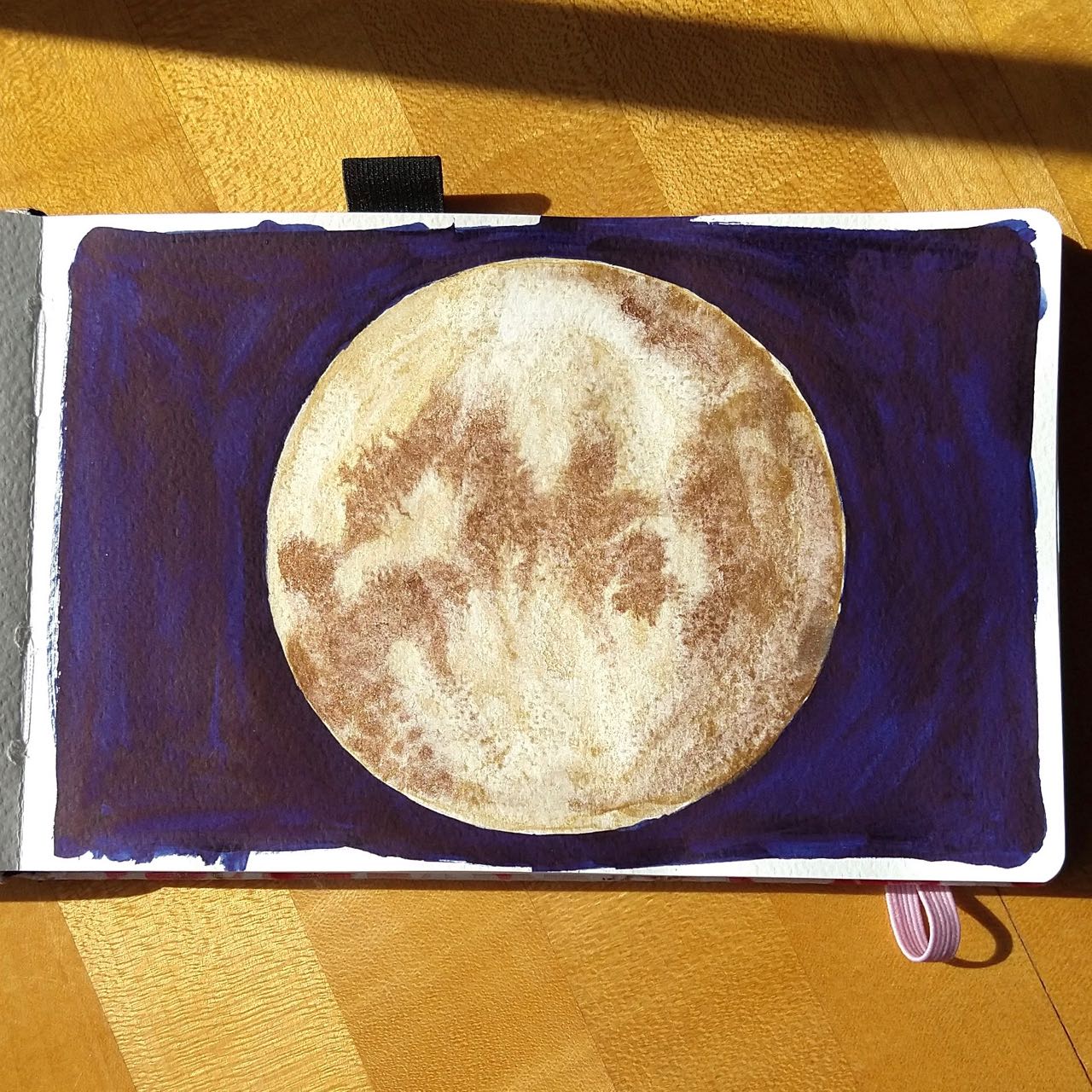
Last year I designated a specific set of art supplies to use: pencil, pens, limited palette of markers, waterbrush. This year I did almost the opposite – I decided to use watercolor for all of them, but with any & all additional items I felt like including. And that worked very well, actually! Without making any deliberate effort (at least at first) I ended up trying several new techniques and combinations.
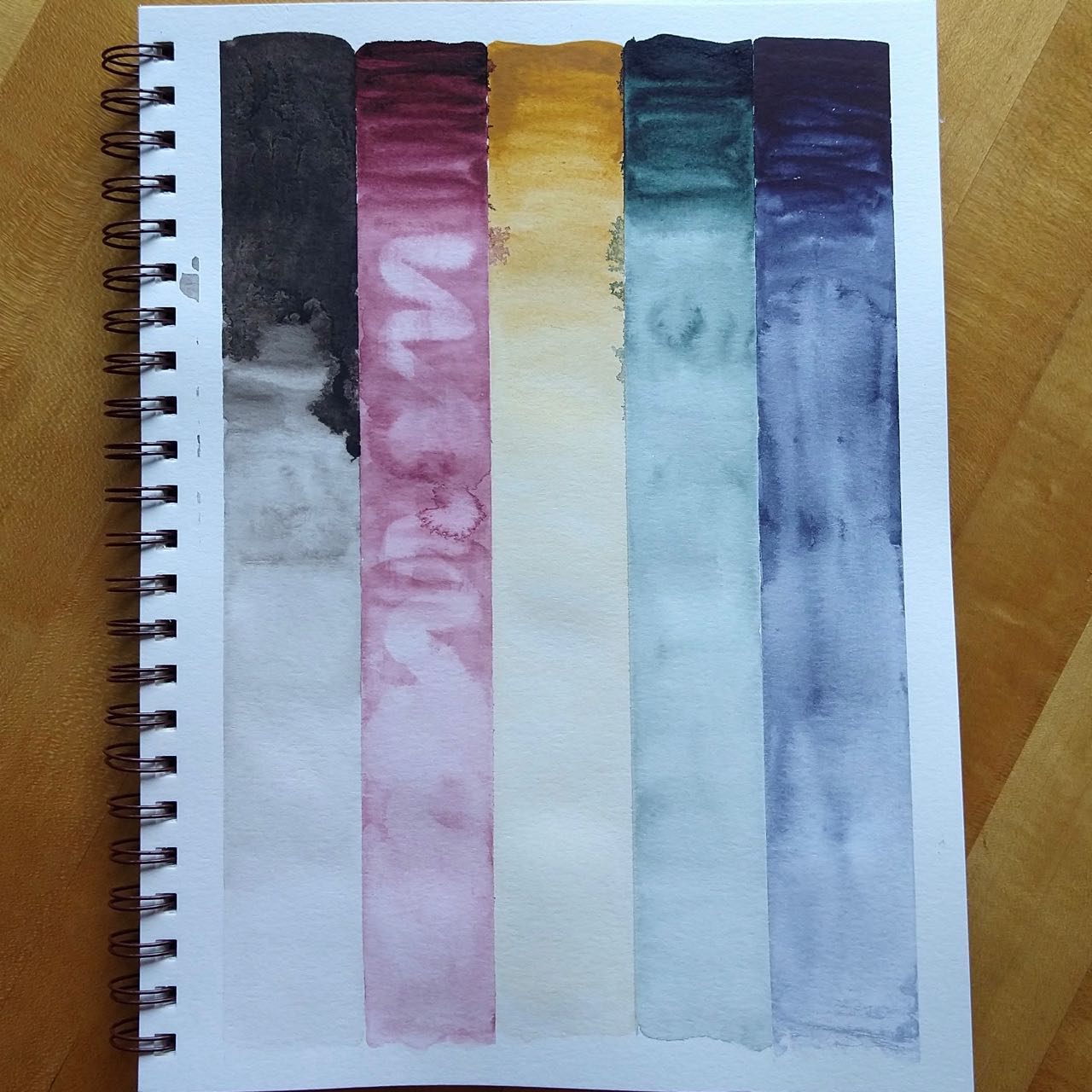
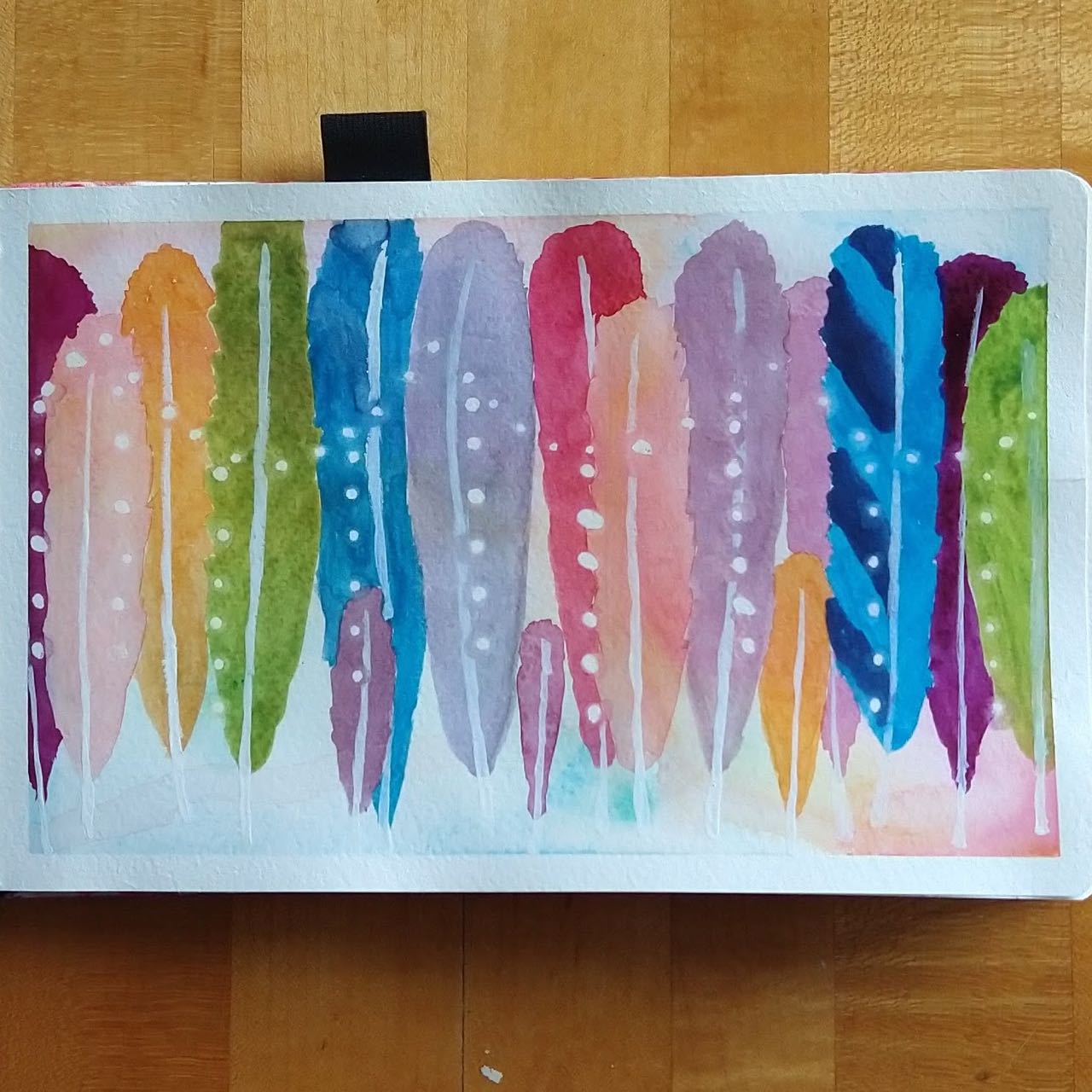
Crayon resist – the crayons kind of got away from me so I was pleased how well this came out in the end. I used a clear crayon from an egg-dyeing kit and a lavender Crayola, though it’s not clear the color is visible at all.
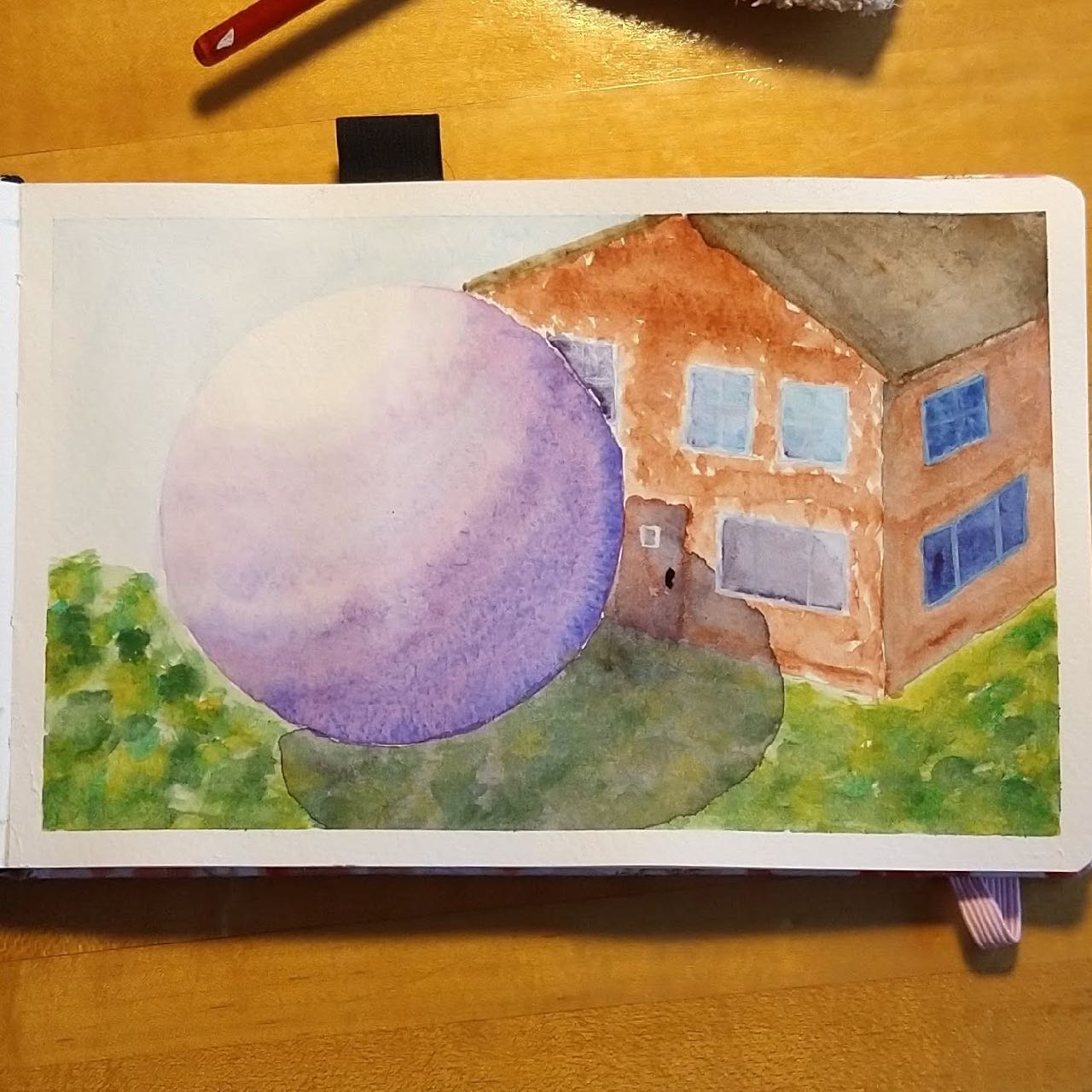
Masking fluid and lifting out with a circular stencil – I hadn’t used masking fluid much before. In fact, I may have only done experiments with it. This was inspired by a Karen Rice video, Bokeh Made Easy For Beginners.
Spatter (I’d done this before but never with any particular success)
Salt – I didn’t use any particular tutorial for this, though there’s a Scratchmade post about salt in watercolor. I used Morton’s table salt and the effect was decent, though instead of “granulated sugar coating” I got something more like “left in the break room for three days and dried out.”
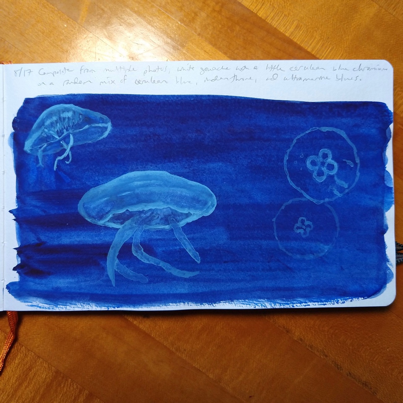
More masking fluid, this time attempting to lift out in a halo around each dot before removing the masks (white lines are gouache)
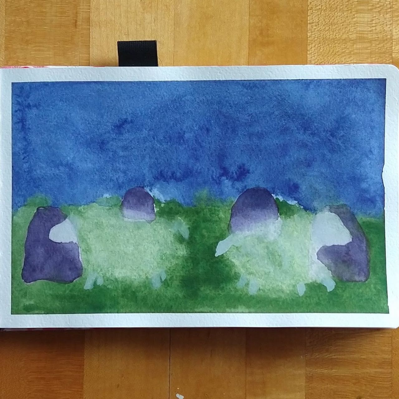
More lifting out, over top of a pale underpainting – I don’t know if lifting out is the appropriate term here. I took a paper towel and mopped up wet paint where the sheep bodies were, and used diluted gouache for their heads, legs, and tails.
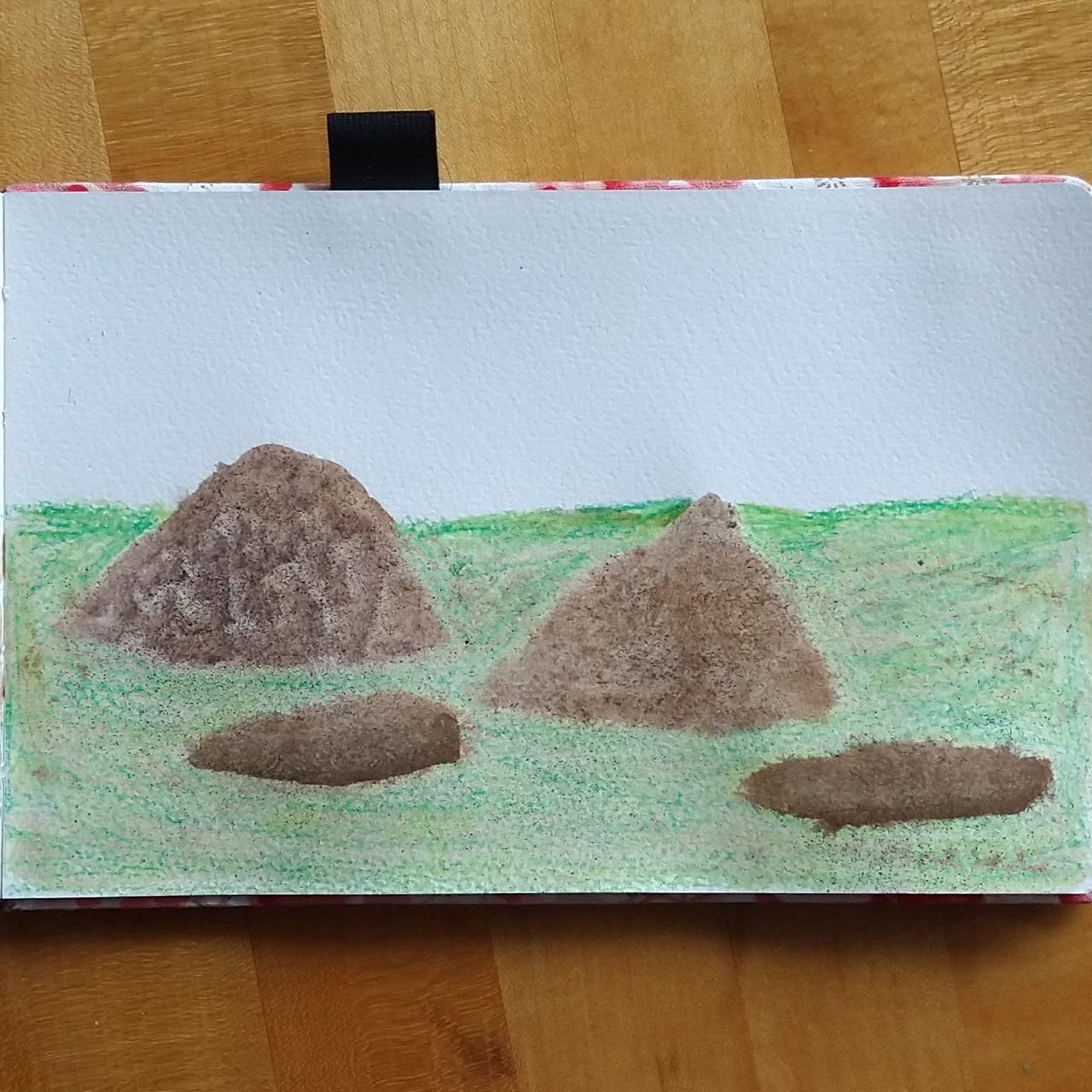
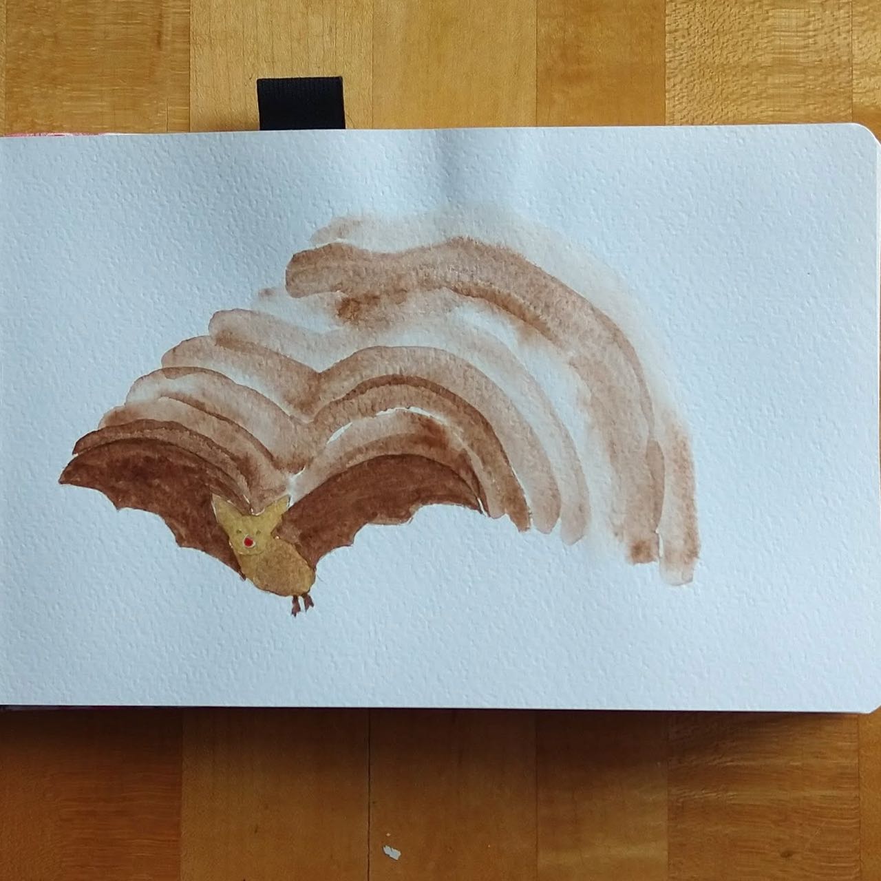
Shaving watercolor pencil on wet paint with an emery board (the green in this is crayon) – I got this idea from a Karen Rice video. I don’t know that it was this video, but it’s a good introduction: Watercolour Special Effects Techniques Tutorial – Painting Pebbles
There were some more compositional things I attempted as well, with mixed success.
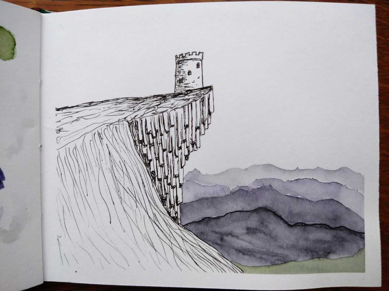
Multiple attempts at perspective and appropriate shading (you know, we’ll get there)

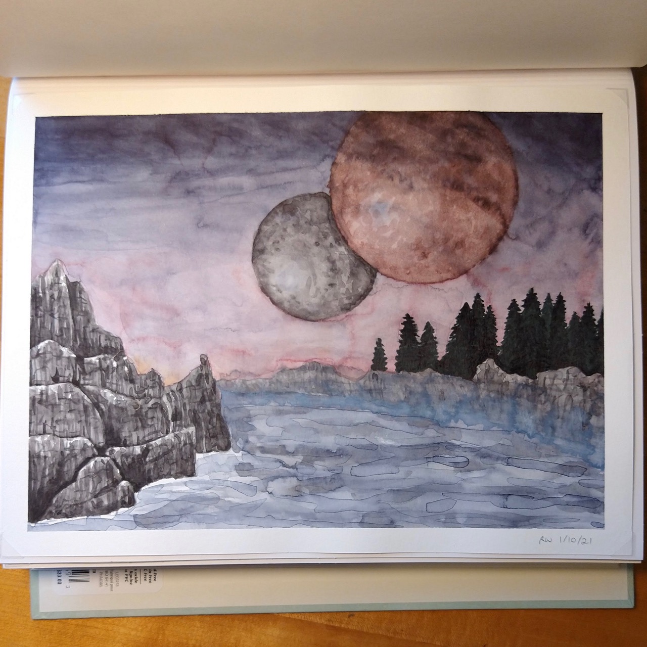
Halloween? 3: Excuse me a minute a giant sphere 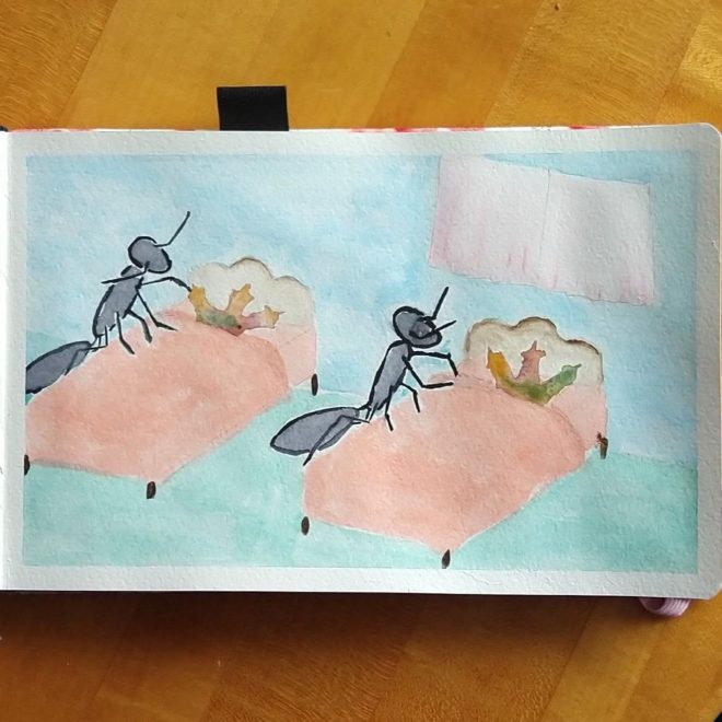
Halloween 5: Black insects settle leaves

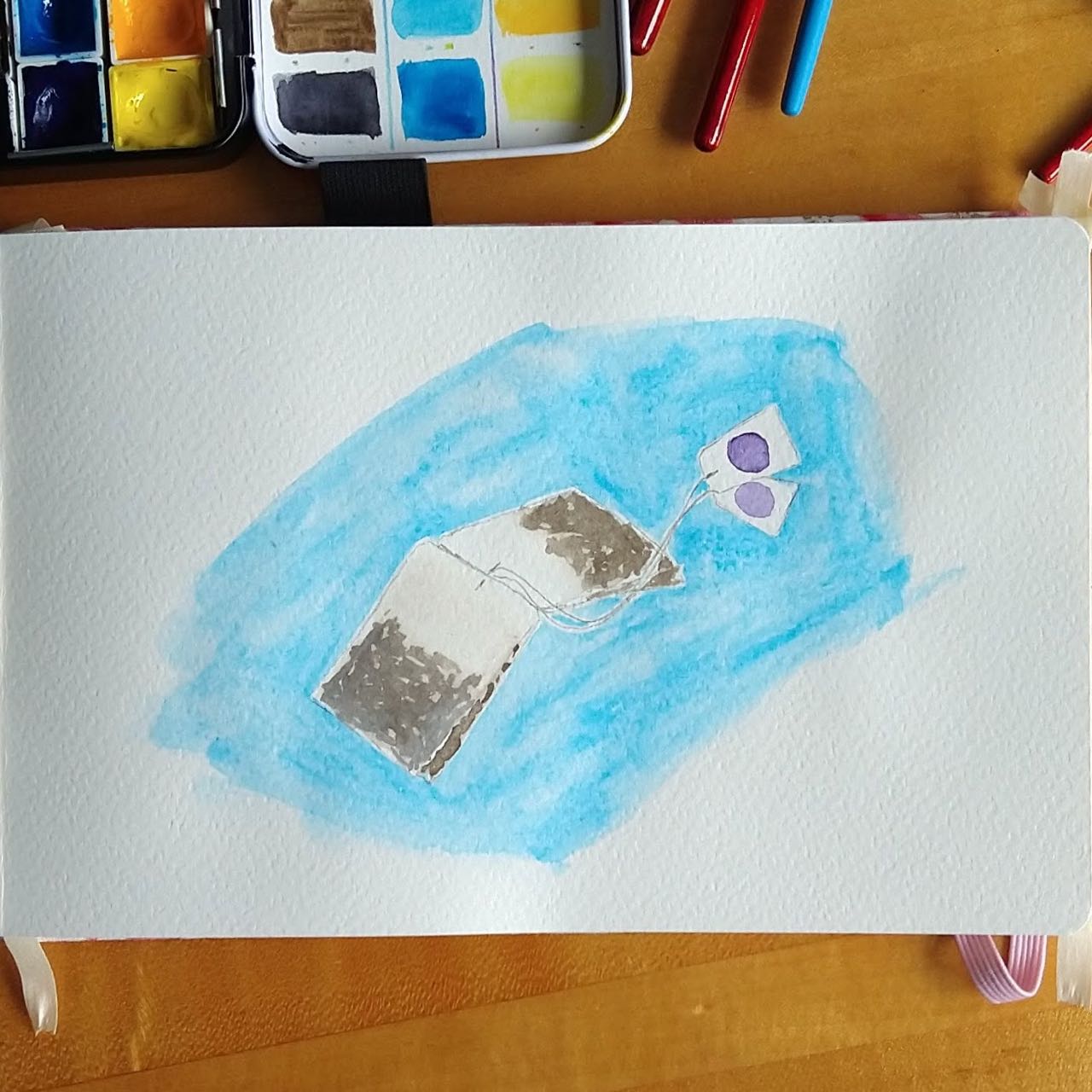
Negative-space teabags
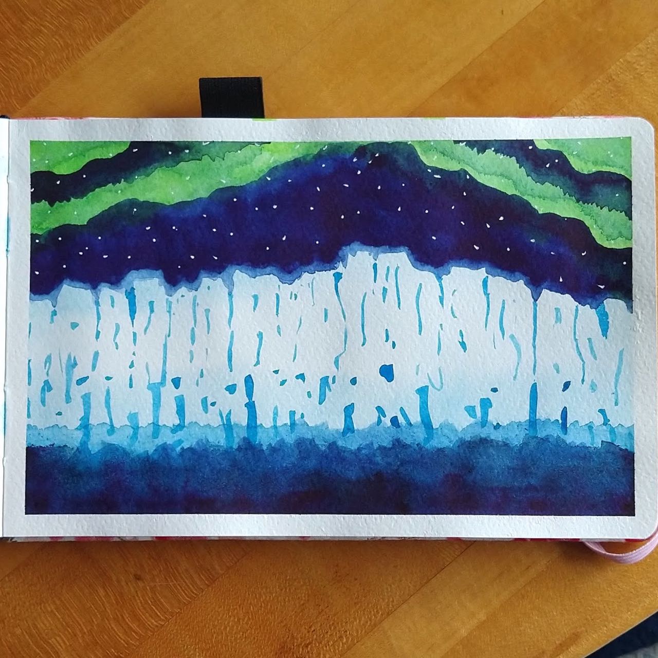
My best Northern Lights attempt yet; also using a technique to try to show glow by giving the item a narrow halo of lightened background color
“Tracers” effect (I soon realized my brain doesn’t actually know what happens when you slide a shape around on the page)
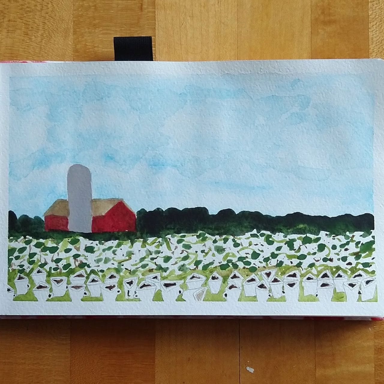
Shallow depth of focus (I actually like this one pretty well, except the flat gray silo sticks out like a sore thumb)
Let’s close with some favorites not already pictured…
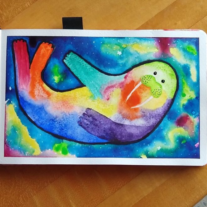
Animals 2: Rainbow space walrus 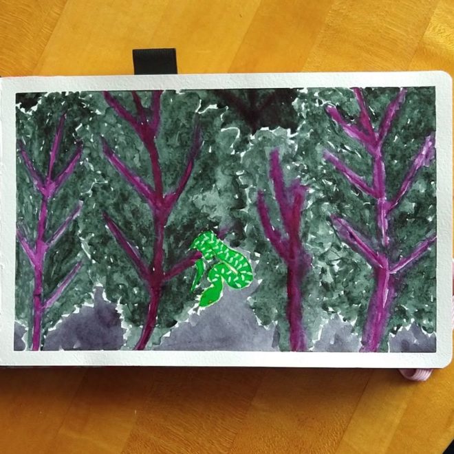
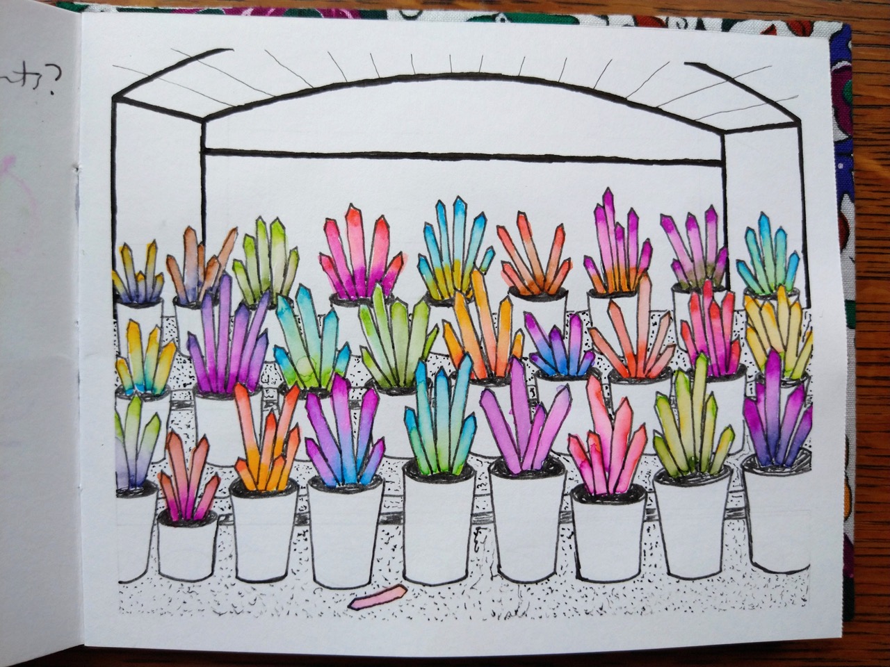
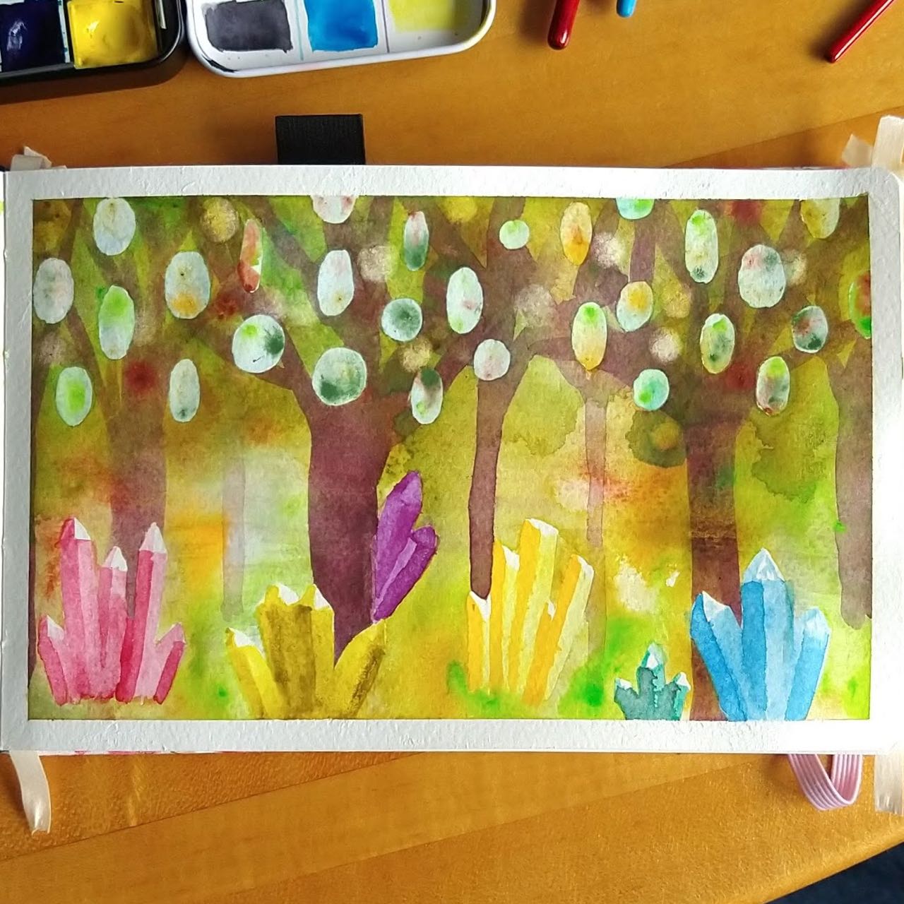
Landscapes 4: Forbidden kale forest 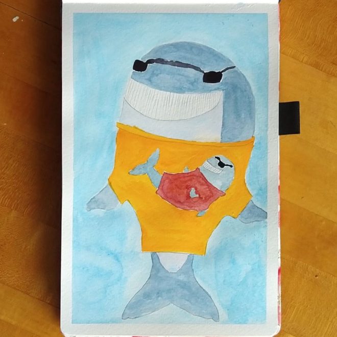
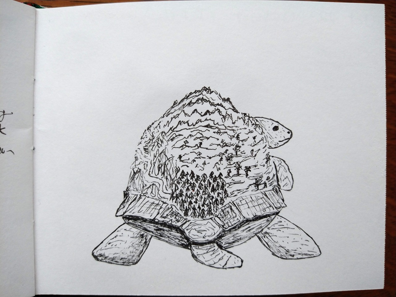
Animals 6: Fricken WHALE 
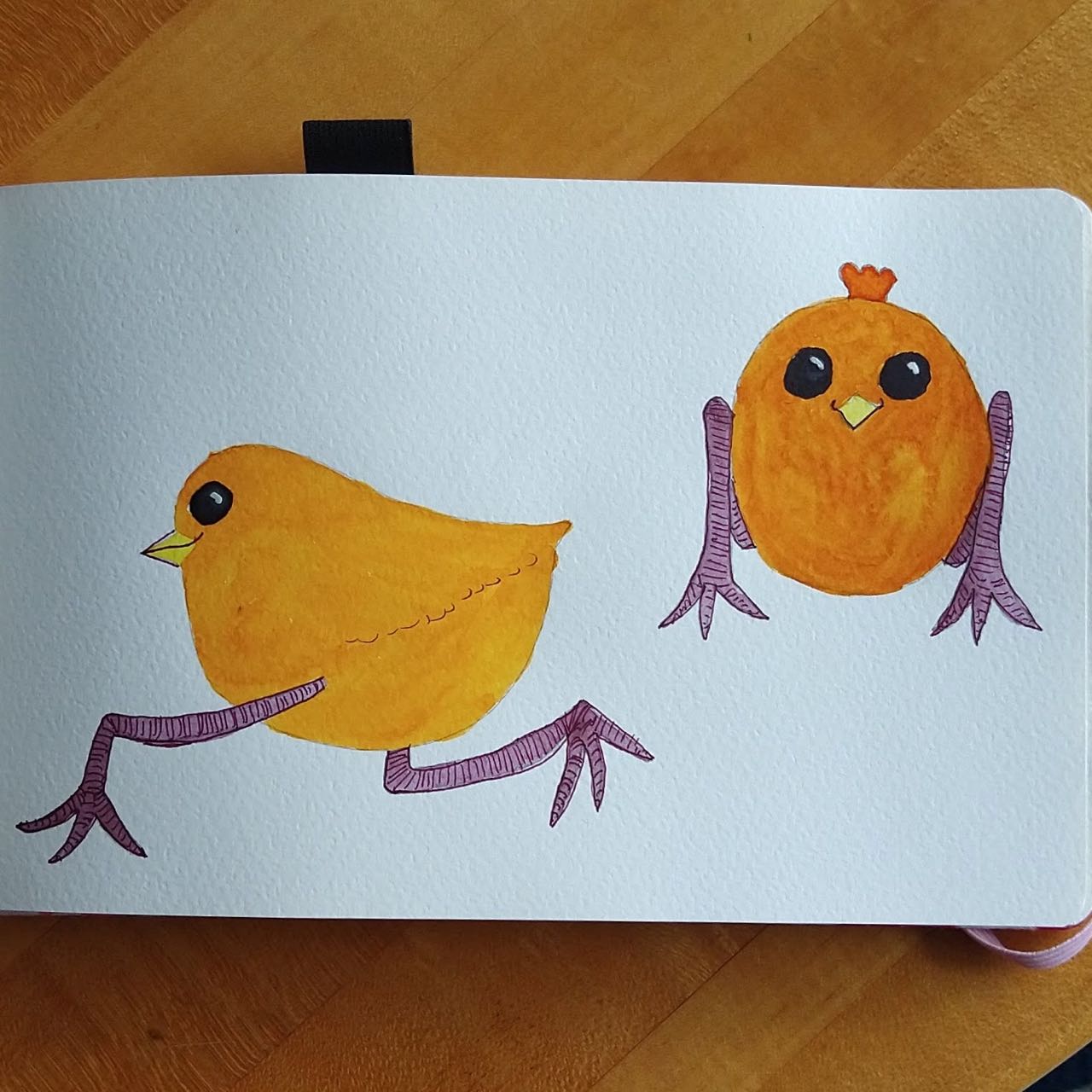
Animals 10: Impossibly cute pudgy birds 
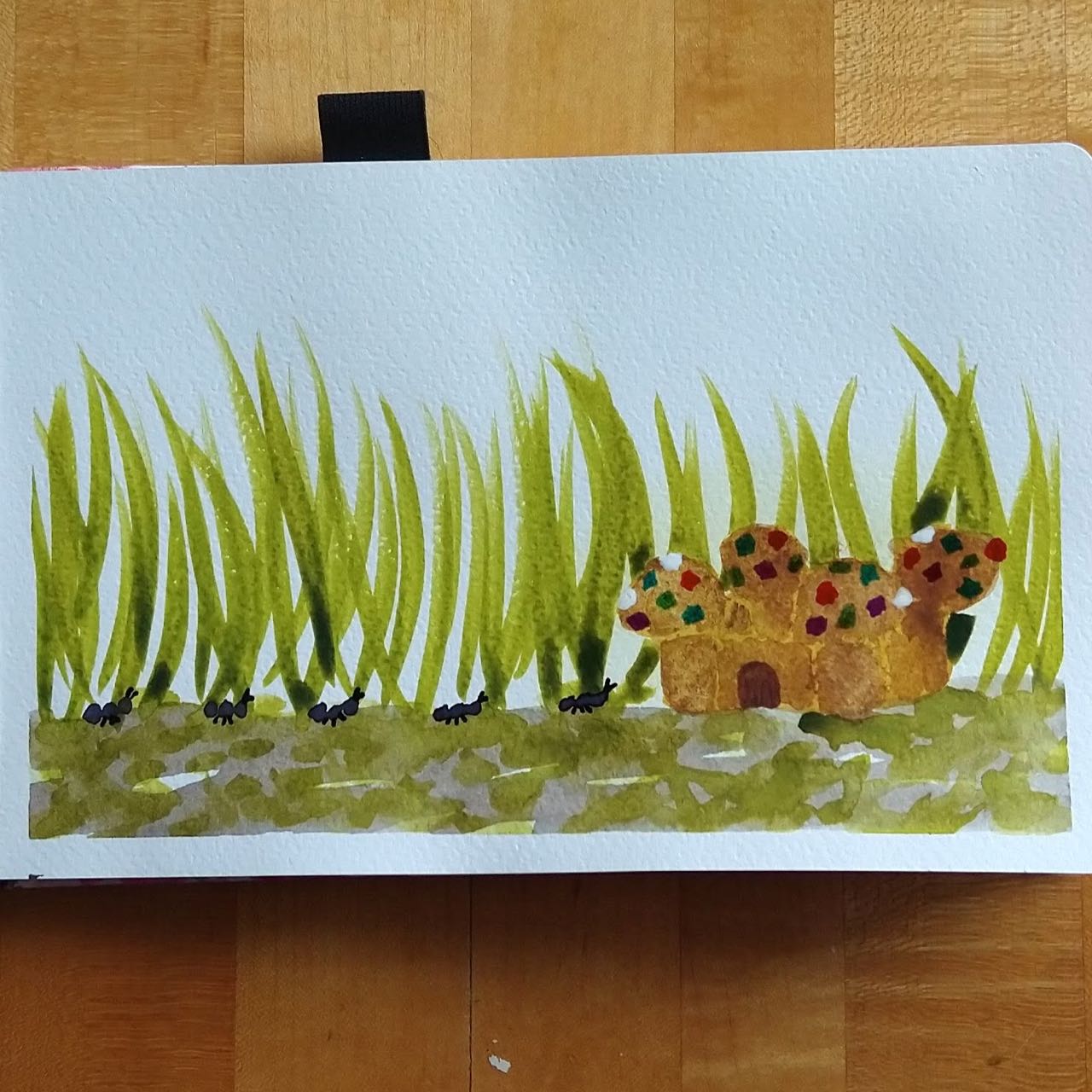
Landscapes 19: Ant fort of jeweled pastry, there is a tiny ant fort 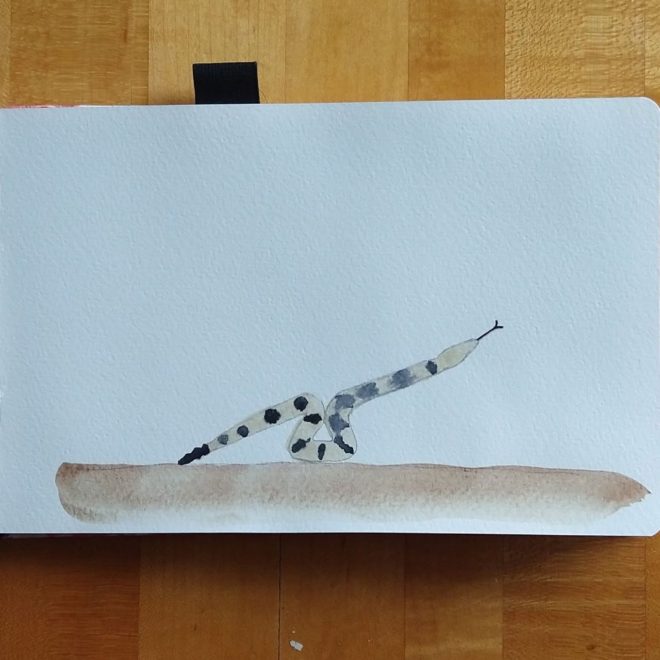
Animals 20: Teeter-totter-rattlesnake 
Animals 22: Way Too Much Cat 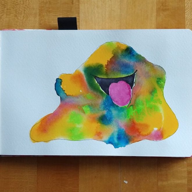
Halloween? 26: The funny, psychedelic slime 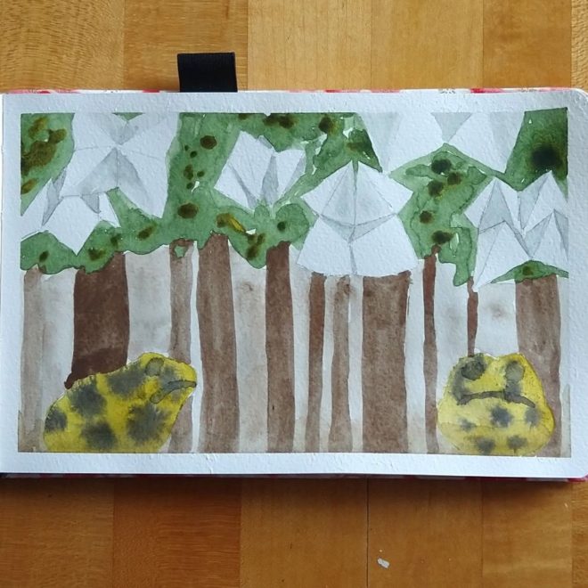
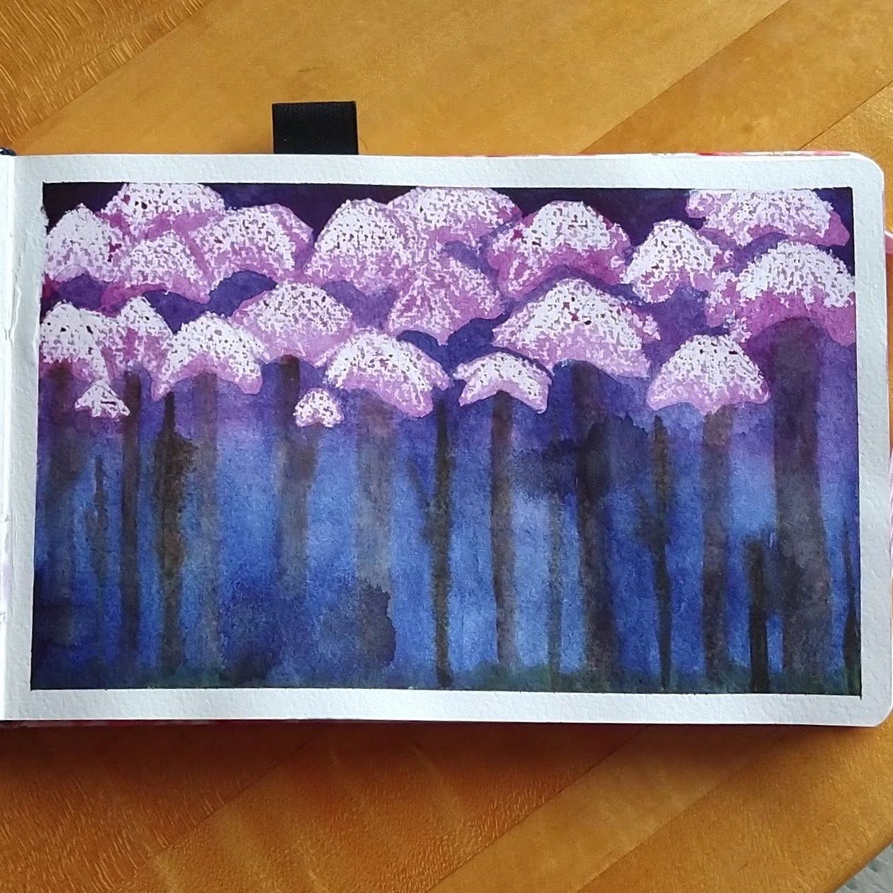
Landscapes 27: Fortuneteller’s grove, toad boulders 
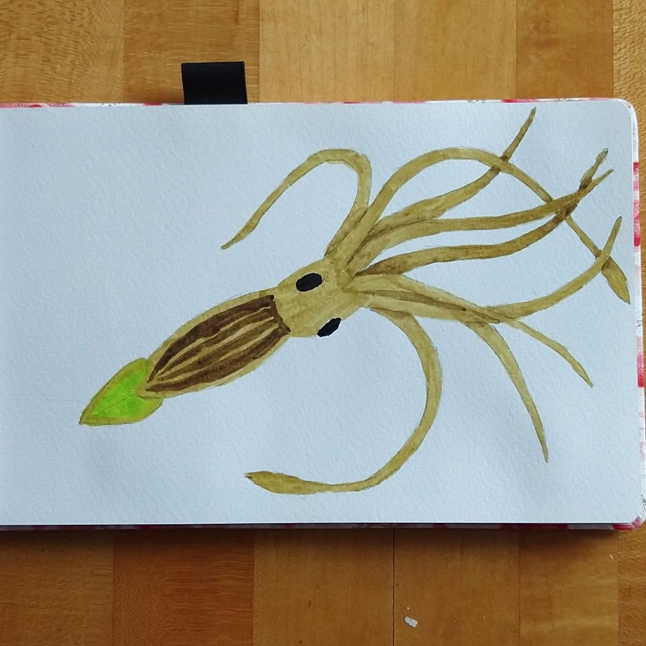
Animals 28: Firefly squid 
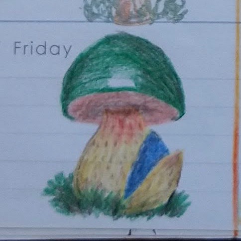
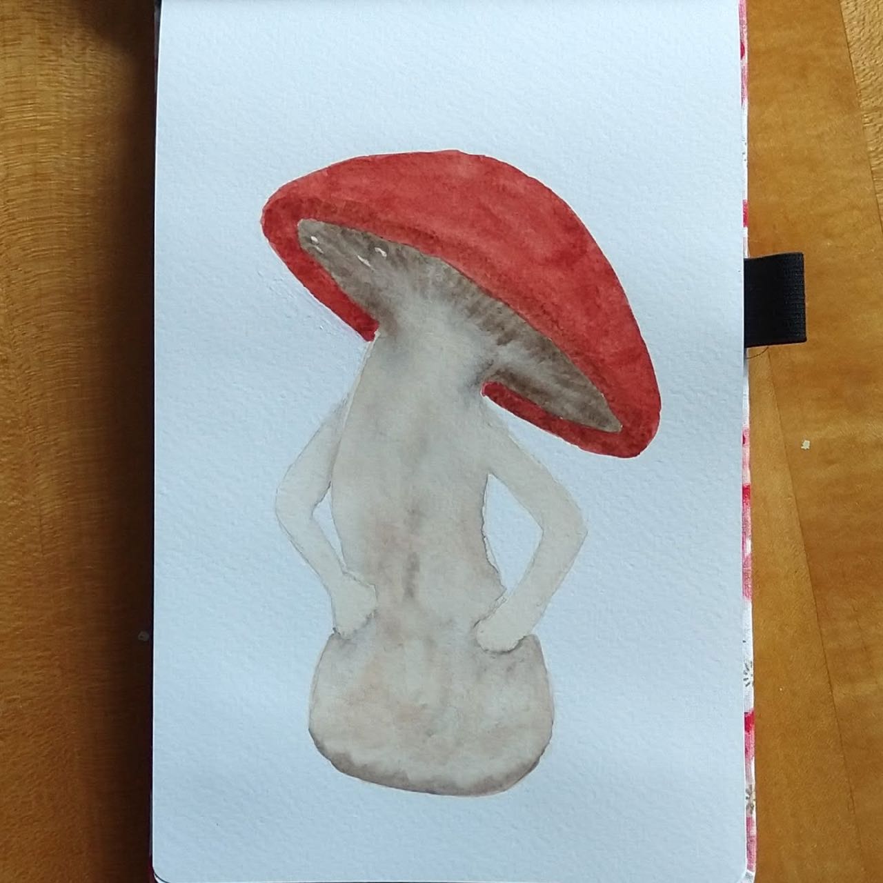
Halloween? 30: A mushroom person


My final tally was:
Halloween – 3
Halloween? – 8
Animals – 9
Landscapes – 11
It is a whole lot! I really like these drawing challenges. I have a prompt and a deadline, and the relentlessness of it means I can’t dilly-dally around – but one month a year is plenty.