A few years ago I wrote a post on my personal blog about creativity and ways to prompt it. The first two entries were “abundance” and “scarcity”. There is inspiration to be had from each: if materials are abundant you can experiment freely without worrying you’ll run out before you get to the “real” project; if materials are scarce – you’re limited to your existing stash – you’ll be forced to problem solve to make things work.
I was thinking about watercolor palettes one morning, as I often do, and realized the same principle applies there for me. A small set of paints is directive: mix everything you need out of these basics, or do without. It can get a little tedious to constantly mix everything, though, and uses up a lot of palette space to do so. On the other hand, a larger set of paints can be quick and easy, as you mostly use the paints directly without mixing. However, I find that sometimes I “forget” mixing is an option and feel stuck with exactly the paints I have, or alternatively, get bogged down trying to mix perfect colors in a way I wouldn’t if I had only a few paints to work from.
As with other instantiations of abundance and scarcity, the happy medium lies in alternating between them.
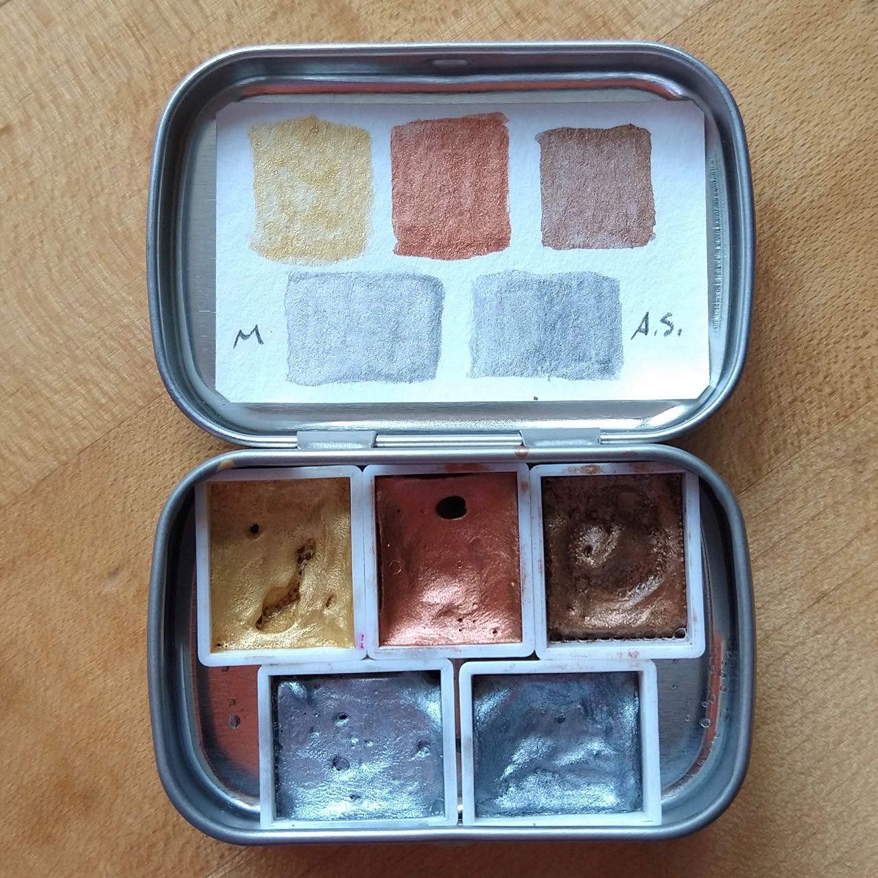
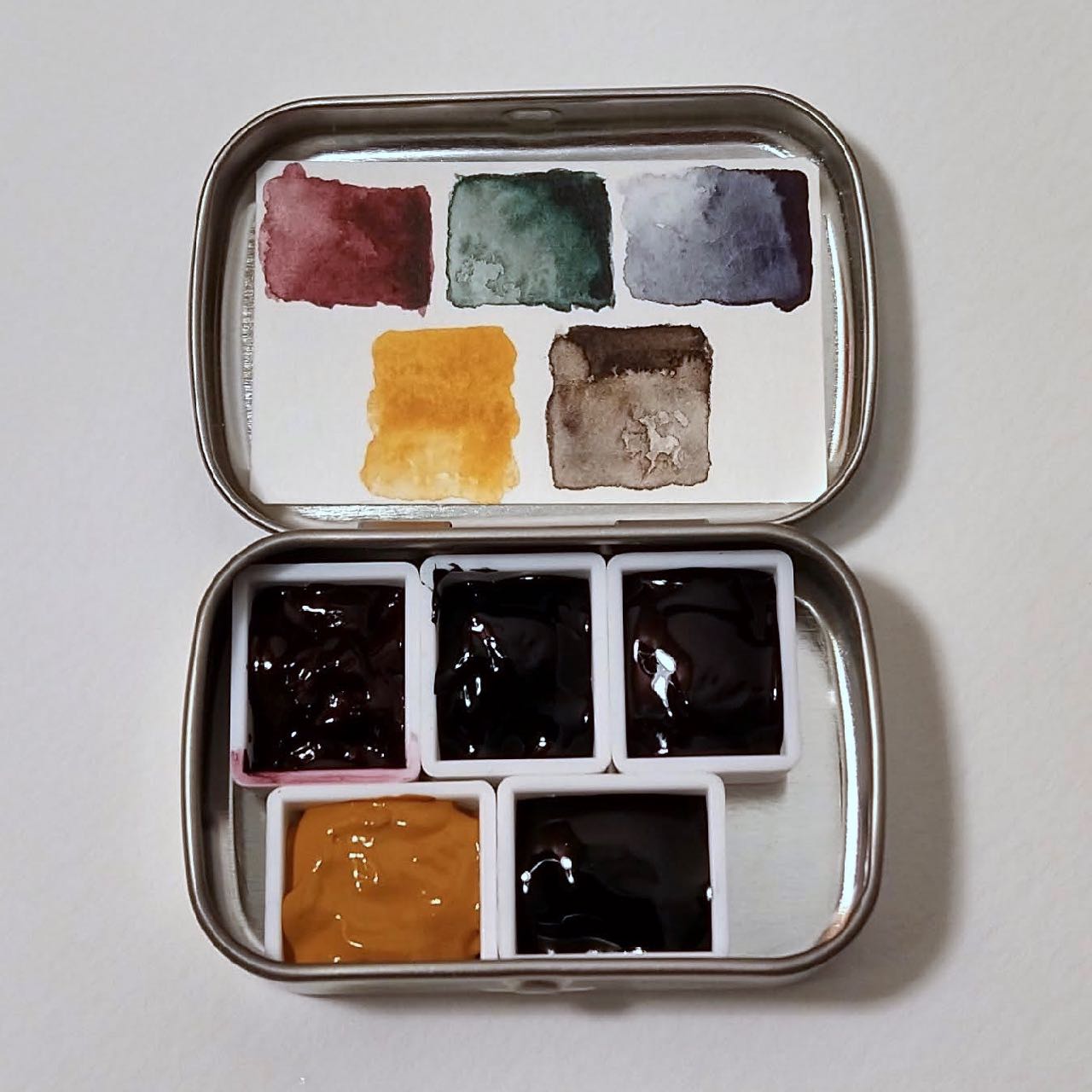
Currently I have one main palette and three mini palettes. You can fit 5 half pans in an Altoids Mini tin, and that’s what I use for mini palettes. The big palette is the kind that comes with 12 half pans but can easily fit 20, especially if you bend the insert a bit to widen the center area.
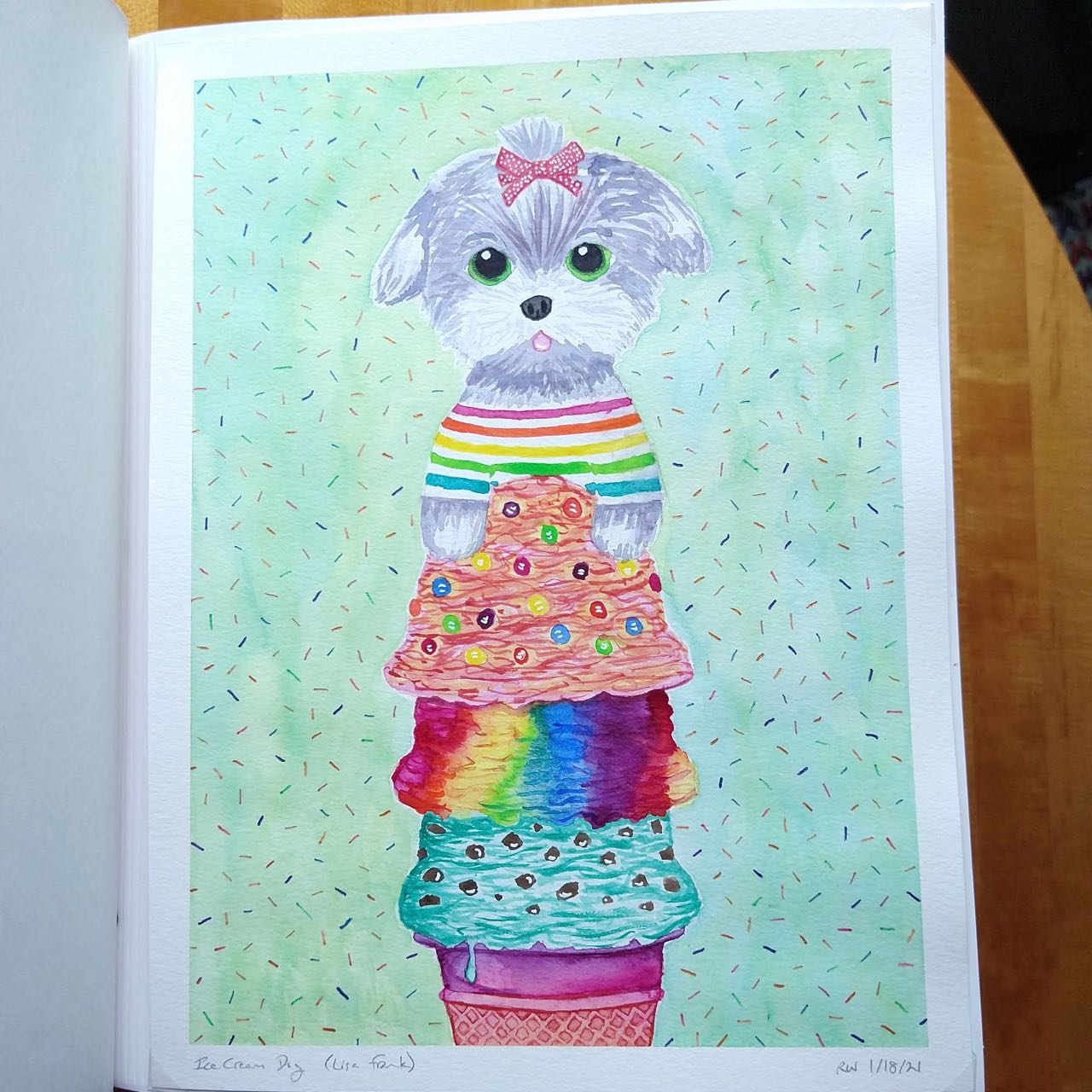
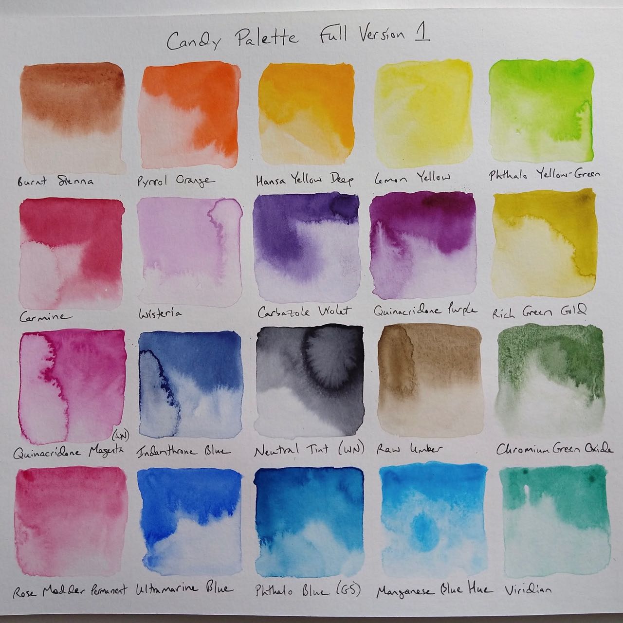
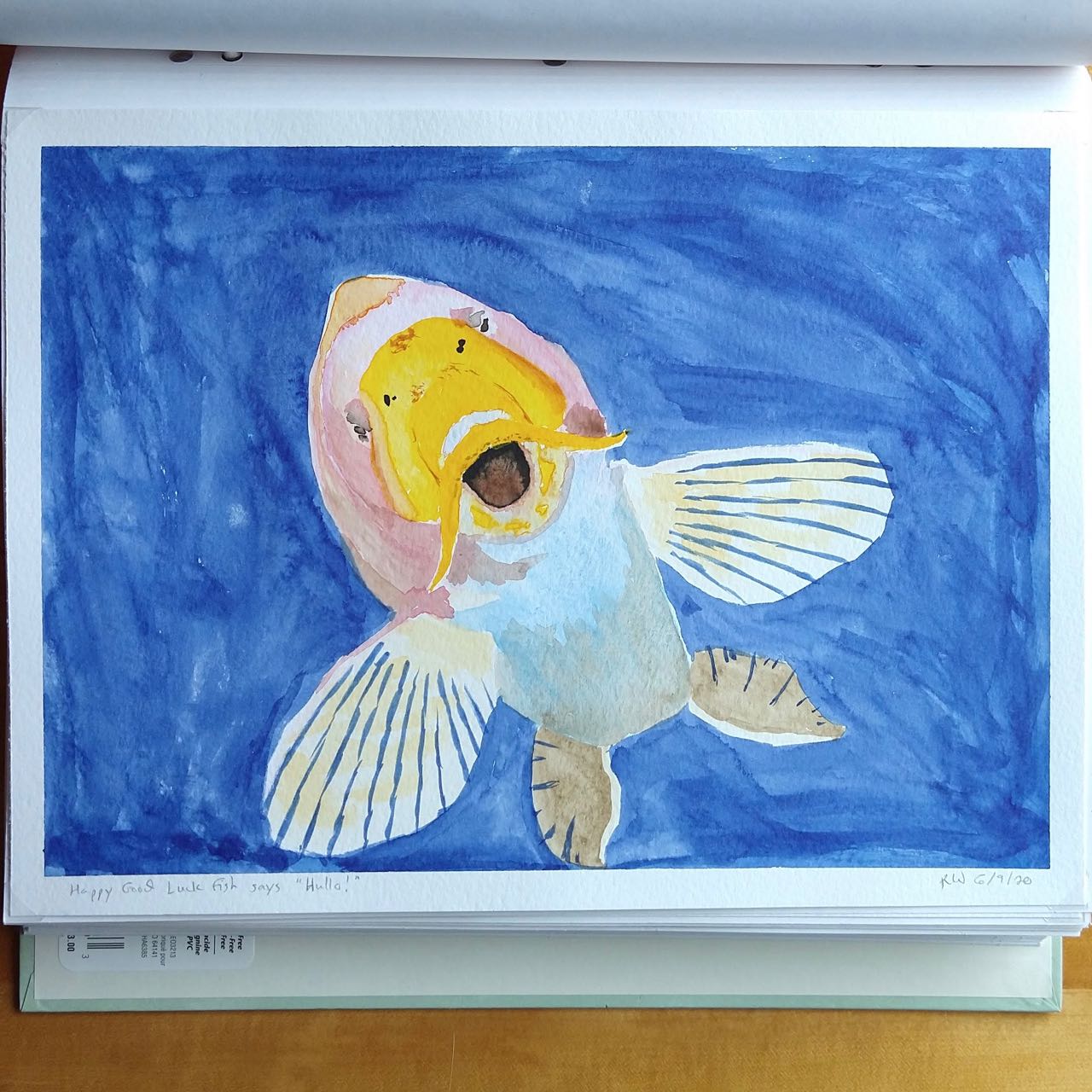
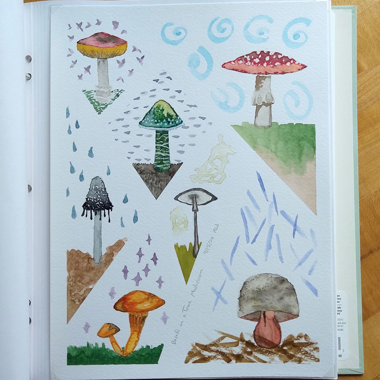
My main palette I call the Candy Palette. It is inspired primarily by 80s Memphis Design, neon graphics, and Lisa Frank, with some additional colors to give more mixing (in particular, neutralizing) options. It’s an evolving project; the Lisa Frank ice cream dog illustration was done with a “first draft” palette of only 11 colors. Twenty colors is its max size, but I do not anticipate it containing exactly the same 20 colors a year from now as it does now – and I look forward to finding out which colors will be replaced!
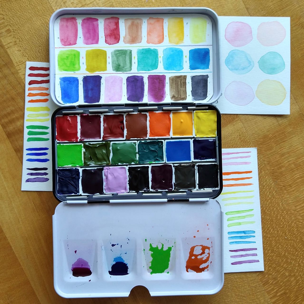
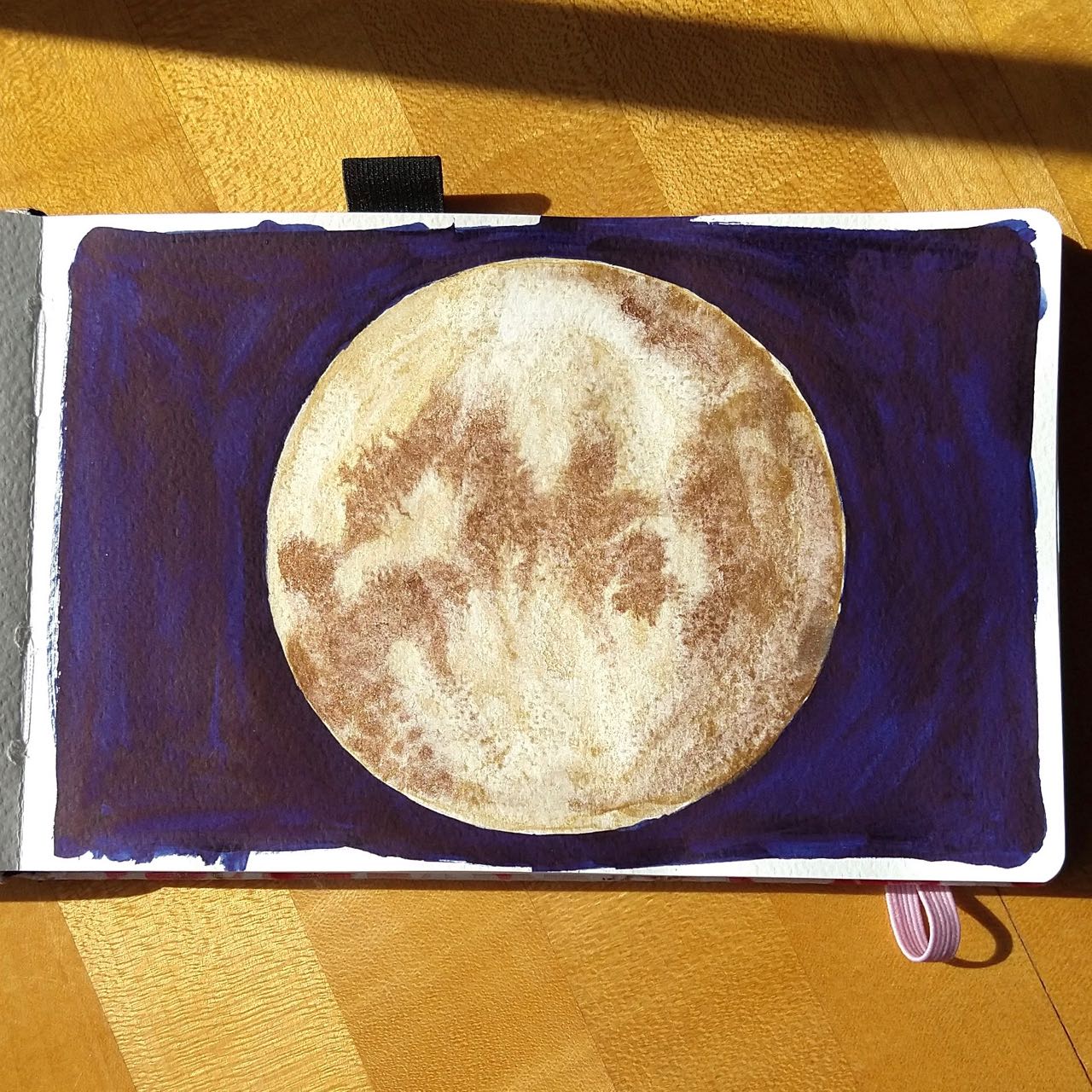
One of my mini-palettes is metallics. It’s available for adding accents to a project, but I’ve been less interested in it than I anticipated. If I get more into the hypersaturated graphic design idea it may come into play more, and in that case I’ll likely swap out one of the silvers – they are way too similar to coexist in a selection this small.
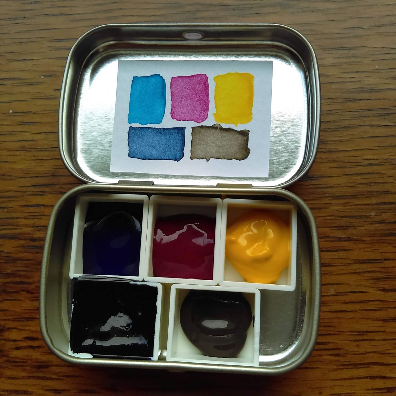
One mini-palette is a standalone general-purpose mixing palette that predates all of the other palettes. It holds watercolor [approximations of] cyan, magenta, and yellow, plus sepia and what was supposed to be a darker, truer blue but isn’t really because of materials limitations at the time I made it.
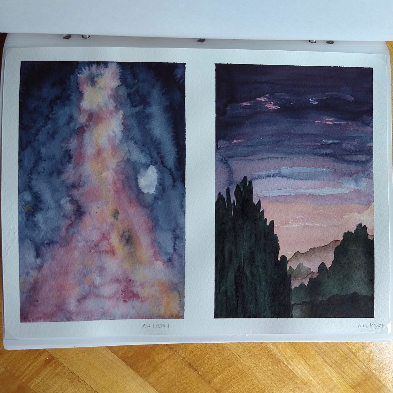
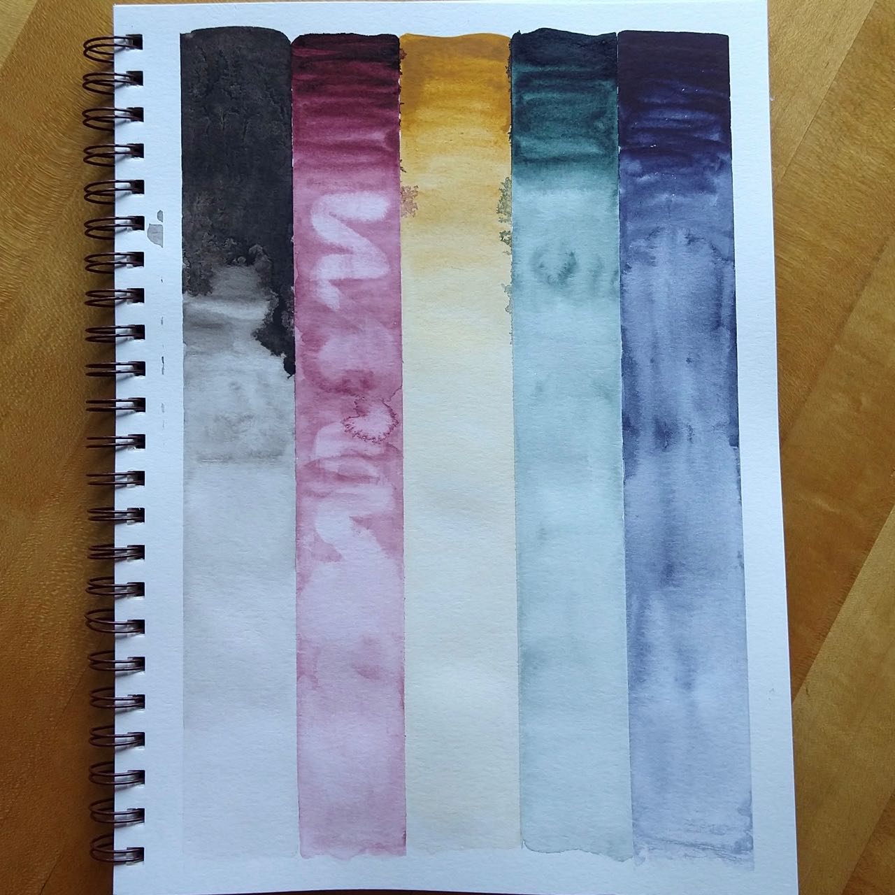
Finally, I have what I alternately refer to as the Dark Desaturated Palette and the Weird Desaturated Palette, my third mini-palette. It’s a standalone palette representing a twist on the CMY palette. It has Indigo, Naphthamide Maroon, and Yellow Ochre as “primaries”, plus Perylene Green because I love it and Van Dyck Brown as a sort of convenience color. White gouache is effectively a sixth color in this palette, as well. It is very…particular, but I quite like it.
The CMY palette has arguably been superseded by the Candy Palette, and I was thinking I’d replace it with a neutrals mini-palette. By which I meant, whatever neutrals I had on hand that weren’t in the Candy Palette, to add options for painting naturalistic images like birds. However, having thought about the abundance and scarcity idea again – and how cycling between them can be so beneficial to avoiding blocks – I’m interested in making another mini palette that stands alone.
But what? The experimentation has already begun.
This is so cool — I love the ice cream dog and the cow with shades, but what I find most fascinating is the organization and color of this post. Thank you!
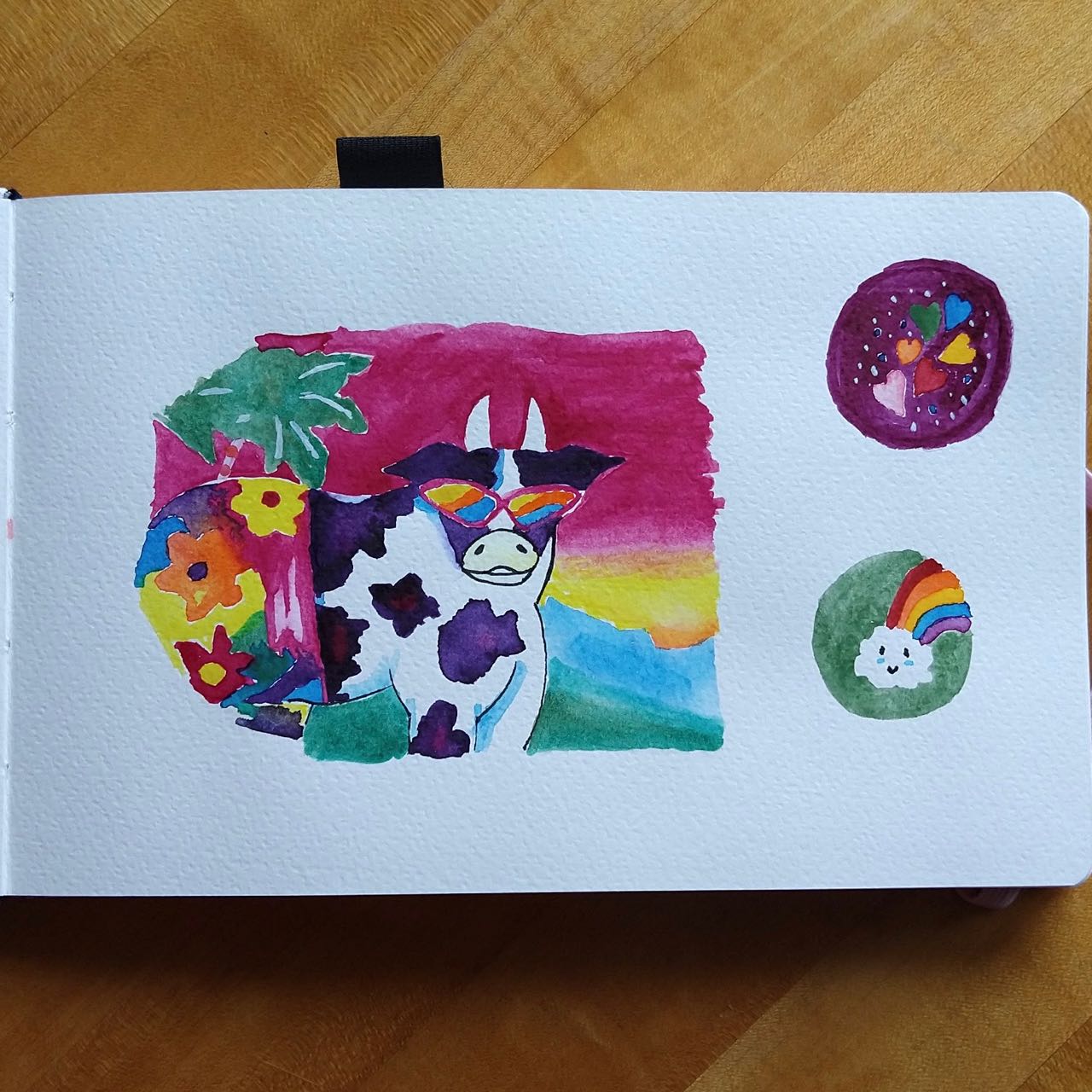
Thank you. 🙂 Sunglasses Cow is another Lisa Frank design – it’s no wonder she had such a large, long-lived empire!