Business decisions

puzzle pieces 
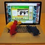
A recent thread on Ravelry about pattern pricing made me wonder whether I’d ever written here about the decisions I made along the way to opening my pattern store. A little looking says no, I haven’t, so here we are. I think it may be of interest both to people considering buying from me and people considering selling their own patterns. Pricing is at the bottom, since I decided it last, in case you want to just hop straight down there.

Getting Started

Before making my first PDF, I read about page layout and graphic design; The Non-Designer’s Design and Type Books taught me a lot of fundamentals at large and small scales, and various sites online chimed in about grids for page layout, style guides, and branding (I still have yet to crack open Brand Against the Machine, though, and Amazon tells me I bought it two years ago).

As part of branding I chose colors (“Stumpy Green”, a pale blue, and originally “Hugs White” but that was replaced with true white), developed my logo (which took a long time, and then a quick inspiration, and then another long time), and chose fonts: Janda Elegant Handwriting for my logo and Rotis Semi-Serif for my pattern text (you can also see it in the header image on this blog). Overkill perhaps, but I wanted all the pieces in place as though I were a huge company, because then they will all just be there as I proceed.

I also needed an appropriate program. As a former mathematician, I first turned to LaTeX, but I simply couldn’t get it to easily do what I wanted in this case. I like open source as a philosophy and also wanted to minimize my start-up costs, and the combination led me to Scribus, a desktop publishing program. More on all the software I use has already appeared here; I’ll just mention that it took me some time to discover the existence of WooCommerce. I actually found it by reading 1-star reviews of a different WordPress e-commerce plugin, where someone said they wished they could have a do-over and use WooCommerce instead.

Layout and Style

Continue reading Business decisions

Better Photography 1: color and contrast on white

I did several photo shoots, and while some refinement is in order (“systematic” is not my middle name), I was able to greatly improve my shots. Here is what worked for me and what didn’t.

The set-up: I had four yarn hippos: red, yellow, blue, and dark dusty purple. I tried many approaches to photographing them against a white paper background, both separately and together. Unless otherwise noted all light came from a large east-facing window.

The goal: Pure, featureless white background with good color and exposure of the hippos in front. I figure if you can accomplish THX 1138-style unbroken white, other pale backgrounds will be easy.

Vocabulary: I cropped basically everything below, even the shots labeled “unretouched,” but shots so labeled are otherwise as the camera uploaded them. I refer to a color or object “blowing out” to mean the situation where the bright parts are so bright that they’ve taken on an unnatural glow, and maybe even whited out.

All Together:

Position matters. Check out the difference between the unretouched photos below, both taken with the Cloudy setting, evaluative metering (iPhoto calls it pattern), +1 exposure, and 200 ISO (chosen by the camera), within two minutes of each other. The photo area is not square to the window; instead, if the center back of the photo is 12 o’clock, the windows are at 4:30 or 5:00. Putting the blue hippo in more light and the red one in less improved the exposure of both. Unfortunately, that’s about as bright as it gets without blowing out the yellow hippo – I can increase the exposure by about 0.1 in iPhoto.

all hippos, red toward light and blue away all hippos, blue toward light and red away

Backlighting seems to help. I wondered whether brightening the backdrop with my Ottlites (true color craft lights, chosen over my actual photography lights because of the smaller region of illumination) would help get a whiter background without blown-out yellow, and I think it did. It is difficult to compare to the shots above, which were taken on a different day. The photos below (unfortunately I forgot to get a comparison shot with the lights off) are the same shot, taken with the Cloudy setting and evaluative metering at +2/3 exposure, camera-chosen ISO of 80, one unretouched and the other with the exposure raised another 0.6 in iPhoto.

all hippos, backlit and at +2/3 exposure, unretouched all hippos backlit, exposure +2/3, another .6 in iPhoto

Continue reading Better Photography 1: color and contrast on white

Happy blogiversary, ReveDreams

third birthday cake Three years ago to the minute I made my first post on this blog. The post, in its entirety, is one paragraph titled “Welcome!”

With this post I inaugurate the craft blog ReveDreams.com. The posts will largely be about sewing and crochet, with a healthy dose of quilting and embroidery, and smatterings of other fiber and non-fiber crafts. The current schedule has me posting Mondays and Thursdays, and I hope to have a good mix of completed projects, works in progress, tutorials and patterns, links elsewhere, and contemplations of practical matters (from systematic investigation of technique to useful ways to store materials). I welcome comments, suggestions, and questions, even if they come a long time after the original post, and whether or not they are relevant to the post at hand!

Other than the posting schedule, this is still current; it’s just not concrete enough to plan around. Over the last month I’ve thought a lot about my purpose in blogging, prompted partly by the full-tilt schedule I’ve kept recently. This is my 53rd post of 2014 and we’re 90 days in — that’s over four per week! I like having new posts every other day, but that rate does not allow consistent high quality. Since it is also easy to have neither frequency nor quality, my paring back needs to be purposeful.

I’ve also been thinking about what would be best for me in terms of site organization and navigation, Ravelry, and Facebook. One thing at a time, though. Today let’s just talk about posting goals. This doubles as a recap of many of my favorite posts from the past year.

ReveDreams Posting Goals

  1. A new pattern in the store monthly: Not only a new pattern, but a pattern presented with creative photos a la the Sluggos, Snouty Hippos, and Big and Little Pi.

    sluggo chase hippos laptop Big and Little Pi

     
  2. An in-depth technical or educational post or series monthly: This could be as simple as exploring the needle join or identifying a mystery stitch. However, I like to really dig in and produce pieces that compare a variety of methods, such as double crochet turning chain modifications or ways to work single crochet in the round (in particular, ways to join those rounds), or that teach techniques in depth, such as useful knots for crafting or how to embroider crochet pieces.

    NJ in second st 1 knotted detail dc swatch rainbow

    round samples together slip knot 2 embroidery-on-crochet

     
  3. Something fun monthly: This could be a free pattern or tutorial, quick and easy (magic chain in crochet, back seat cupholders) or more involved (miniature Christmas trees with decorations, bicycle handlebar saddlebags). It might be a free extension to a pattern for sale, like the One-Eyed Sluggos. Or it might be a photo spread, like the recent Ami Folklore pair or the more distant Assyrian Monsters shoot (of which most of the photos are on Stumpy’s Facebook page).

    magic chain bracelets cup holder from side tree decorations

    mini saddlebags 2 one-eyed sluggos in the leaves scene 1 of The Sorcerer's Apprentice on ReveDreams

     
  4. Web curation monthly and behind the scenes: There is a lot of useful, interesting, and inspiring material in the World Wide Web, and especially if I had to spend a lot of time separating the wheat from the chaff on a particular subject, I like to share my findings with you. This is a key component of most of my static pages: Learn Crochet is self-contained as long as you don’t want videos, but I link out not only to videos but to additional instructions given with words, photos, and diagrams, as mine are. I plan to continue to expand and refine that resource as well as Sewing Tidbits, Scrap Users, and Learn Hand Embroidery. Although I include relevant links in many of my posts, on the blog my curation is concentrated in my First Friday posts, of which I most want to emulate two done in the last six months: art journaling with fiber, which featured other crafters’ work, and mythical origin stories of crafts, which involved a lot of needle-in-haystack research (pun intended, but only retroactively). Look for more descriptive titles on those posts henceforth.

    sc 2 Do Distill Depict stitching spider-19263_640

     
  5. Spontaneous, irregular posts of projects and thoughts worth sharing: This will form the remainder of my posts, with no quota. I want to share my creations and experiences, but will apply the Mr. Ed Rule and speak only when I have something to say. I’d expect very occasional posts on productivity, organization, teaching, or other ancillary subjects, and for most of the posts in this category to be projects. A few favorites from the last year: first overlay crochet project (and pattern review), bassist monster, and embroideries from my husband’s drawings.

    blocked overlay B bassist contemplation stitching

Incidentally, the part about comments from my initial post is still true — don’t be shy, even if the post is almost as old as the blog itself!