On the uses of tracing paper

silver-valley-275289_640 Early this year I used tracing paper in two different ways in short order, so I thought I’d write a little post about it.

The main way was for patterns to stitch through, whether by machine or by hand. For the sample embroidered seam block I made for my second crazy quilting class, I used strips of tracing paper to make evenly-spaced repeating stitch patterns from my graph paper sketches. It was a mixed blessing – the stitching creates the perforations to tear along to remove the paper, so shorter stitches = easier removal. Mine were long and tearing the paper without stressing the stitches was a challenge. I also had trouble with the stitches getting loose when I tore away the paper and had to consciously stitch more tightly than I normally would to accommodate it. One piece of advice unrelated to my block: don’t fill areas while the tracing paper is still attached because you will never get it out.

Advice from elsewhere: Susan at Plays with Needles recommends Bienfang brand tracing paper in particular. I’ve only tried what I have – Strathmore – and it’s fine, but takes a little effort to sew through. I’ll test out Bienfang when I need a refill. If it’s easier to tear that will help a lot with avoiding stitch distortion.

monogram applique and its pattern 
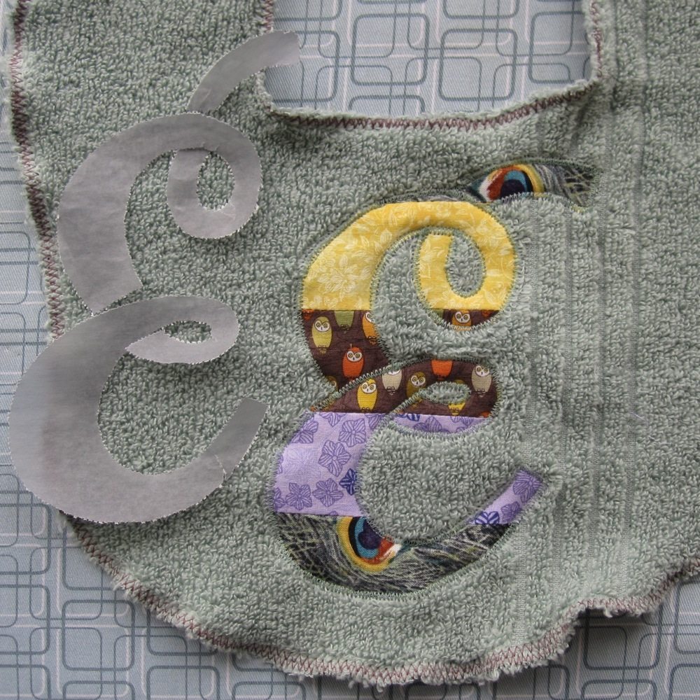
I also printed a large letter to be used as an applique pattern. I put tracing paper through the printer by trimming it to about 8″x10.5″ and taping it across the top to a standard sheet of letter paper, an idea I got from a tutorial for decorating candles with printed tissue paper. I generally use a small piece of tape at each end of the short edge and two more equally spaced in between.

Advice here: if you’re printing large solid letters and don’t have a way to convert them to outline, change them to a nice medium gray. Then you use less ink, which means less time to dry and less distortion from soaking the paper. For my applique I straight-stitched by machine around the outline of the letter, removed the paper and trimmed the applique fabric as close as possible to the stitch line, and then made a tight, narrow zigzag all the way around. In one spot my trimming was a little too close and I had to recapture the fabric with the zigzag, but most of it went as planned.

[This pattern was for a gift for friends we see very infrequently, and in fact we passed it to a mutual friend and it may not even have made it to them yet, but I am tired of holding on to this post until the gift is given!]

Incidentally, the letter shown is Oleo Script Swash Caps, a font that’s free for commercial use. The designer also has the plainer Oleo Script, but I specifically wanted an E with loops in it. Both are thick enough that at a large size you don’t even need boldface to make a good applique letter.

tracing paper rub-on 
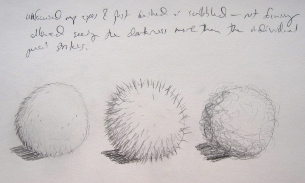
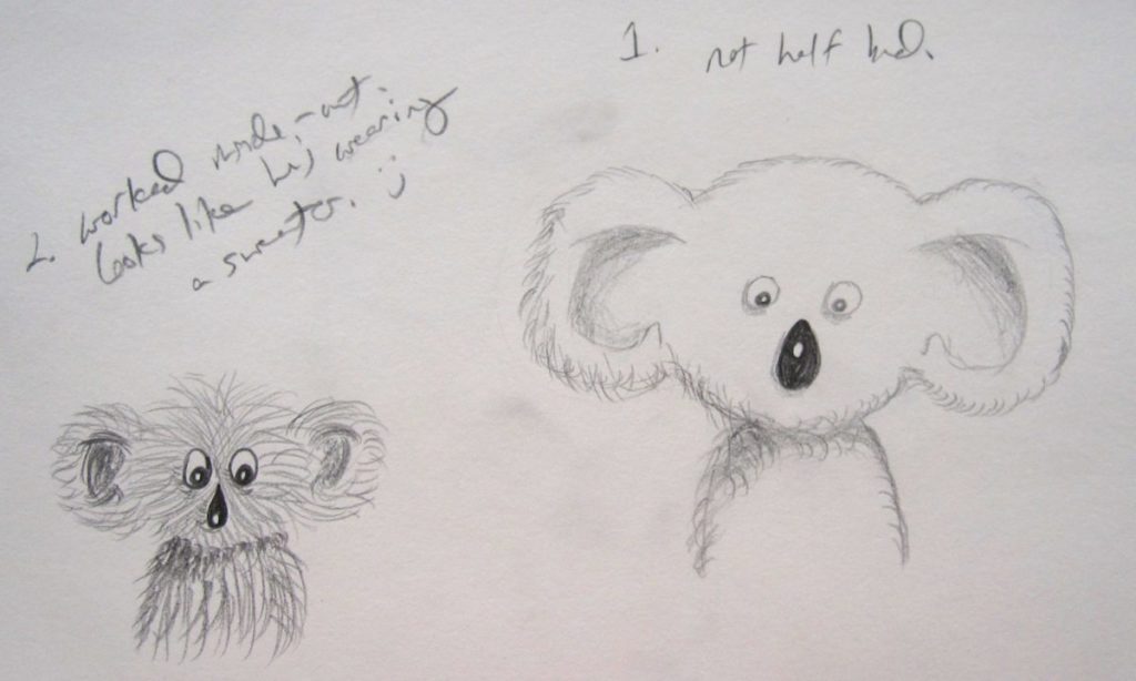
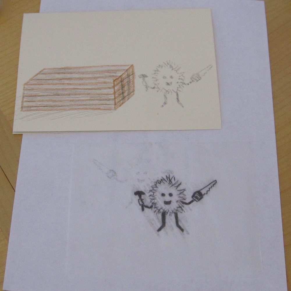
My second recent use for tracing paper was to make my own rub-on transfer. I was drawing a greeting card and had a little fuzzball character that I didn’t trust to come out as well in future versions, so I traced him with a soft pencil (4B), turned the tracing over, and rubbed with the (eraserless) back end of the pencil to transfer graphite. Then I went back with a colored pencil to finish the drawing. It worked really well, and I was even able to face him in opposite directions by turning the tracing paper over, using the first trace as an image to trace again, and rubbing the second version onto the page. In the photo, where I’ve transferred but not drawn over the image, you can see where the first version rubbed onto the scratch paper a bit, ghostly under the tracing paper (which itself is not easy to see).

By the way, as I focus less on blogging I’ve found myself using Facebook a bit more, mostly for random crafty links I come across (though the Fun With Vintage Patterns album gradually grows). I’m not regular with it, but moreso than here.

Plannerama

I have a crafty new planner. Previously, I’d gotten a hardbound planner that had 2-page months between sets of 2-page weeks. However, it was too large for my purse, and I found myself failing to consult it on a very regular basis. When I get busy I just want to have a piece of paper lying out with my to do list. It occurred to me I might be able to have my cake and eat it too with a planner in a mini binder.

diecut mini binder cover insert

That cover is two sheets of pearly scrapbook paper cut to size, with the diecuts in the top layer made with my Cricut machine. You can see a strip of elastic – my previous pen holder was a pocket that hung onto the front of the planner with two elastic loops. It’s been a while since I switched to the binder and I only just finished my new pen holder. Meanwhile I got used to taking out the current planner page and sliding it under the elastic on the outside of the binder, so when I replaced the pocket I turned one of its elastics into a separate loop.

Pen holder for mini binder

Here’s the new pouch! It’s basically two flat pieces, each double-sided, one with a zipper and the other with a layer of heavy interfacing and some ribbon loops. It didn’t come out well enough to be worth sharing a pattern for, but I’m happy with it. The striped dividers are more scrapbook paper, cut to 8.5″x5.75″ so they stick out a bit.

And finally, here’s a highlights reel of my binder’s contents, so I can share the sources of my printables.

Oh, and you may be thinking, “if her previous planner didn’t fit in her purse, there’s no way this one does!” You’re right. I got a little staple-bound two-year monthly planner to use for that. It is full of silly animal pictures.

Ten lessons down, twenty to go

I’ve gotten through the first ten lessons of You Can Draw In 30 Days, so I thought I’d show some highlights. Unfortunately my computer refuses to talk to my scanner (or perhaps vice-versa) so I have photographs, which are really not the optimal way to present drawings. Also WP apparently doesn’t allow captioned photos to share a line, so it’s going to be a tall post.

introduction "pretest"
The book’s “pretest”: spending two minutes on each, draw a house, a plane, and a bagel.
lesson 1: the sphere, plus bonus challenge
Lesson 1: The Sphere. Spheres with shading, and a bonus challenge to draw a high-contrast, black and white photograph of an apple.
bonus challenge to lesson 3: advanced-level spheres
Bonus challenge to Lesson 3: Advanced-Level Spheres. Illegible notes say “sunken sphere?” on the left and “too close. needed more position difference” on the right.
lesson 5: hollow cubes, plus bonus challenge
Lesson 5: Hollow Cubes, plus its bonus challenge to draw a treasure chest. Word out in space is “undershadows.”

Midstream materials report: I’ve been using drawing pencils I’d purchased some time ago, Staedtler Mars Lumographs. The images above (from lessons 1-5) were drawn with a 4B and those below (6-10) with a 2B. I like the variety of shades of the 4B but prefer how much longer the 2B keeps its point, so I plan to try out a 3B to see if it’s a good compromise.

I started out with a Paper Mate White Pearl eraser, which worked okay (it’s perfect on the rougher/cheaper paper of Games Magazine, by the way), but bought some others at the art store to try, along with some blending stumps, though I haven’t used those much. The Faber-Castell PVC-Free eraser was okay, but kind of plasticky. I’ve been very happy with the Staedtler Mars Plastic, though. It erases really well. Of course it’s probably designed to work well with my Staedtler pencils. I also have a Prismacolor Kneaded Rubber eraser, but I haven’t used it yet. I’ll probably try to preserve it for fine erasing and use the Staedtler for anything that doesn’t require precision.

bonus challenge to lesson 6: stacking tables
Bonus challenge to Lesson 6: Stacking Tables.
bonus challenge to lesson 7: advanced-level cubes
Bonus challenge to Lesson 7: Advanced-Level Cubes.
anthropomorphic vegetables
I asked my sister what I should draw for her birthday. Her answer was “anthropomorphic vegetables.”
another bonus challenge to lesson 7: advanced-level cubes
Another go at the bonus challenge to Lesson 7. I never actually drew it in, but this was a place I was able to take advantage of my husband’s drawing ability, by asking him how he would do the shadow of the elevated box on the ramps and ground.

The vegetables were drawn with plain old Crayola Twistables colored pencils, which are terrific to get some variety of color without so much it that becomes paralyzing. This set has red, red-orange, orange, yellow, yellow-green, green, sky blue, blue, violet, light brown, brown, and black. I have a book called “Draw Cute Animals in Colored Pencil” coming soon, so they will get more use.

When I made my felted pencil bag I thought it was probably overkill size-wise, but with 16 pencils, 2 erasers, 2 stumps and a stump cleaning paddle, it’s pretty well full.

warmup to lesson 8: cool koalas
Warmup to Lesson 8: Cool Koalas, practicing texture and using texture to shade. Chicken scratch says “unfocused my eyes & just dashed or scribbled – not focusing allowed seeing the darkness more than the individual pencil strokes.”
lesson 8: cool koalas
Lesson 8: Cool Koalas. Writing: on right, “1. not half bad.” On left, “2. worked inside-out. looks like he’s wearing a sweater. :-)”

I spent a total of 22 drawing sessions on those ten lessons (including one for the “pretest”), plus 5 sidetracks in the midst of them (and 9 sessions prior to starting the book). At the present rate it’ll be 30 weeks rather than 30 days; that’s fine, I’m learning patience in addition to drawing. Originally I thought a year of drawing might be adequate to get me where I wanted to be, but now I’ll be pleased if it’s merely two years. I’m certainly much more confident than I was, and (I think) also much better – or at least my quality is more reliable. My approach is different and in particular more measured. However, a year just isn’t a long time when it comes to learning a new skill of any depth (duh). After I finish this book I’ll have a lot of work left to learn shading, which is addressed but not at all thoroughly, and facial expressions, which certainly aren’t part of the curriculum. Shading in particular could easily take another 30 weeks to feel confident about.

I think Lesson 7’s bonus challenge (crazy geometric buildings) and the warmup to Lesson 8 (fuzzy, spiky, and wooly balls) were my favorite parts of 1-10, the former because it felt like I was successfully drawing something “real,” and the latter because I thought they turned out really well.

I’ve improved enough that I don’t have to force myself to continue. I regularly have trouble fitting drawing into my day, but it’s rewarding even at the frequency with which I do it. One realization I had at about lesson 8, seeing my husband drawing with friends, is that my lack of drawing skills was a hindrance to me enjoying the activity (in contrast to, say, my lack of bowling skills), and I certainly don’t have to be Rembrandt to get past that problem. I don’t know that I’m quite there yet – I’m still pretty self-conscious about the act of drawing – but it shouldn’t be long.